Figure 1. Long Live Fashion’s Home Page
Long Live Fashion
Experience Design
November 2022
tools
Figma, After Effects, Final Cut Pro
scope
3 weeks
my role
Visual Design, Content Strategy, User Journey
team
Ana Lizarraga, Angela Lu, Benjamin Yang, Sabrina Chang, Monica Meng
Experience Design
November 2022
tools
Figma, After Effects, Final Cut Pro
scope
3 weeks
my role
Visual Design, Content Strategy, User Journey
team
Ana Lizarraga, Angela Lu, Benjamin Yang, Sabrina Chang, Monica Meng
01. Overview
A pre-event microsite proposal that showcases TextielMuseum’s Long Live Fashion! exhibition. The exhibition presents the world of sustainable couture and raises awareness about fast fashion.
02. Framing
We aimed to surface the core message of Long Live Fashion’s exhibition onto the digital space in order to entice users to visit the event.
To do so, our content strategy consisted of:
- Sorting content by color to facilitate navigation
- Using consistent interactions that relate to our client (rippling effect for textiles)
To do so, our content strategy consisted of:
- Sorting content by color to facilitate navigation
- Using consistent interactions that relate to our client (rippling effect for textiles)
03. User Journey
My main role was developing a content strategy and user journey to design for. Our main content strategy was sorting content by color to facilitate navigation — we did this by assigning a different color to each section of the microsite.

Figure 2. Diagram of the microsite’s user journey, demonstrating the colors assigned to each page of the microsite.
User Journey and Content Strategy
I defined the user journey by creating a strong content strategy of sorting content by color. This way, users can easily associate the pages to their corresponding color and navigate the microsite with ease.
04. Featured Pages
Once the content strategy was defined, my team and I dove into the design of each page.
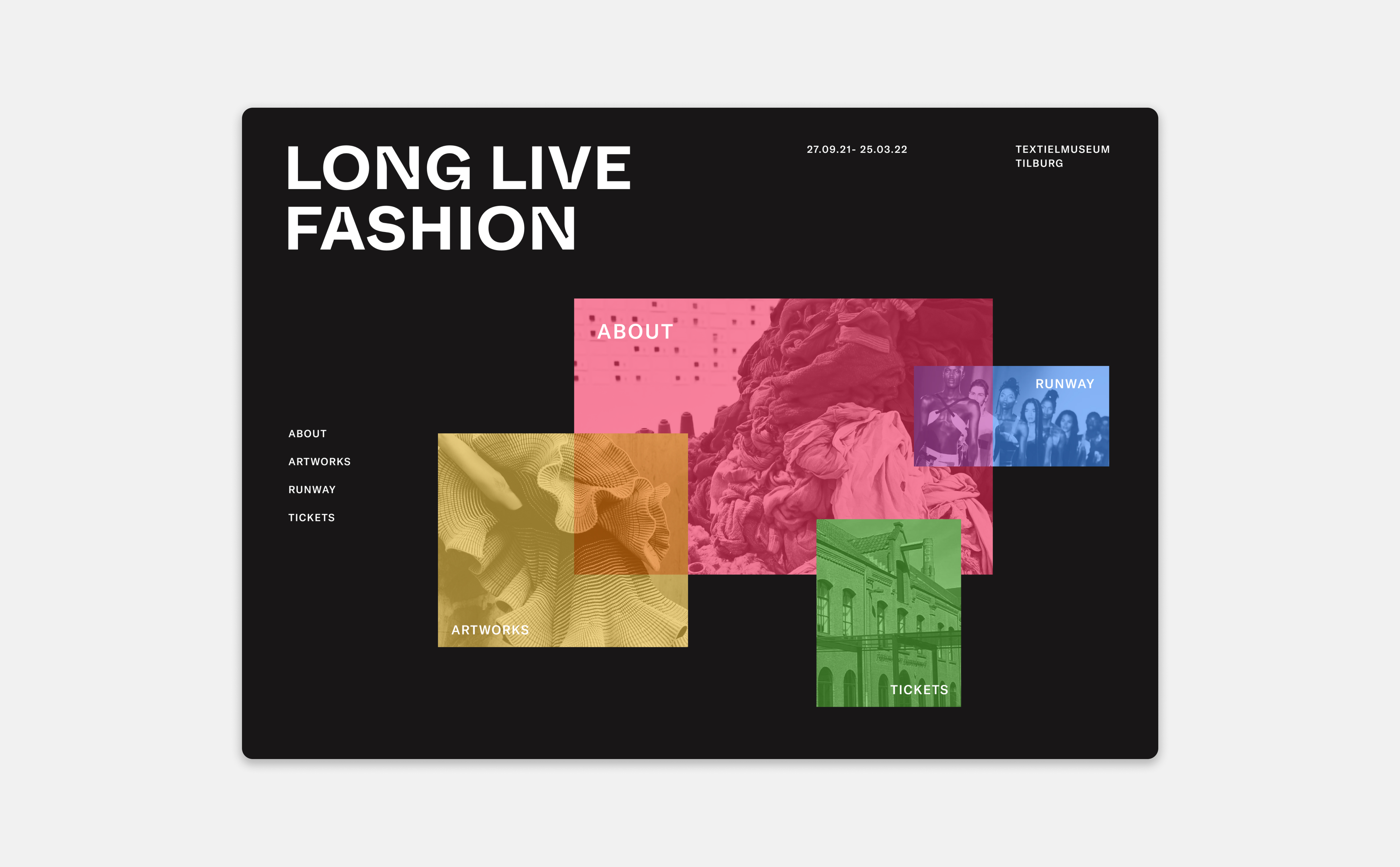
Home page
After various iterations, we defined this as the microsite’s home page, including elements from my own designs as well as my teammates’. It features a ripple effect on hover, a cursor that indicates action, and a secondary menu that facilitates access to all of the pages.

Figure 3. My initial design proposal for the homepage, from which we extracted some elements before defining the final design
Navigation
I prototyped an interactive navigation menu that mimics the home page layout, to further facilitate navigation and association of content to colour.
About
I was in charge of the visual design of the about and artworks page. The about page introduces what the exhibition is about. It is meant to pique the user’s interest, and provide an overview of the exhibited artworks before they can decide whether they would like to visit the exhibition.
Artworks
I designed the artworks page, which displays some of the pieces that are featured in the event. It consists of a carousel of images of the artworks, a cursor that indicates action on hover, and a secondary menu to facilitate the exploration of the artworks. To keep consistency in navigation, this page also uses a horizontal scroll, which we maintained across the microsite.
Tickets
Users can purchase tickets on the microsite's ticket page. In this section, all clickable actions are highlighted in green. A progress bar located at the bottom of the page shows users their current position in the checkout process, allowing them to conveniently modify dates or change number of tickets without having to navigate back.
05. Art Direction

Figure 4. Design qualities and principles that drove our design decisions
As a team, we pulled design qualities from Chris Ashworth’s work, and analyzed Ellen Lupton’s design principles in order to design a unique identity for the event. These qualities and principles drove our graphic experimentation process.

Figure 5. In the beginning, three different directions were proposed in the form of posters
We developed 3 different visual approaches in the form of posters before defining our project’s visual identity. Through careful iteration and evaluation, we determined that the design on the far left exhibited superior versatility across various media. This realization led us to identify an opportunity to establish a content strategy based on organizing content by color. As a result, we incorporated the design quality of overlapping colors into our microsite.
06. Graphical Assets

Figure 6. The application of a large scale billboard in comparison to other assets illustrates its versatility regarding forms of various sizes.

Figure 7. Various assets that demonstrate the ability of this direction to be used functionally beyond the microsite
Finallly, we extended the design to graphic assets to test their scalability and versatility, developing a stronger visual identity.
07. Reflection
While working on this project, I learned that sleepless nights are not so bad when you have an amazing team that you can count on. I was very lucky to be able to work with such talented people, and to get to know them better throughout the completion of this project. I learned the value of compromise, of stepping up for your team, and putting the team’s interests above all else: to create an exceptional microsite that we would all be proud of.
![]()

Figure 8. Team photo taken at 2:35 am on the day of the presentation for our IAT235 course, symbolizing the course name through the timestamp.