Figure 1. Mockup of Falling Fruit’s home screen
Beam Magazine
Editorial Design2024
tools
InDesign, Photoshop
scope
4 week academic project
my role
Graphic designer (individual project)
01
Overview
In a senior editorial design course at Simon Fraser University, I was assigned the task of creating a magazine concept from scratch. This project involved defining the target readership, establishing the editorial mandate and brand, planning the editorial lineup and flatplan, designing a cover, a table of contents, and one editorial feature story.
02
The Brand
I chose a four-letter name for the magazine because it is more visually appealing as a logo, and four-letter words are easier to remember. I selected "Beam" for its double meaning: in architecture, it refers to a type of structure, while in everyday life, it signifies a ray of light. This play on words aligns with the readership and the brand I aimed to create.

Figure 2. Brand name and rationale.
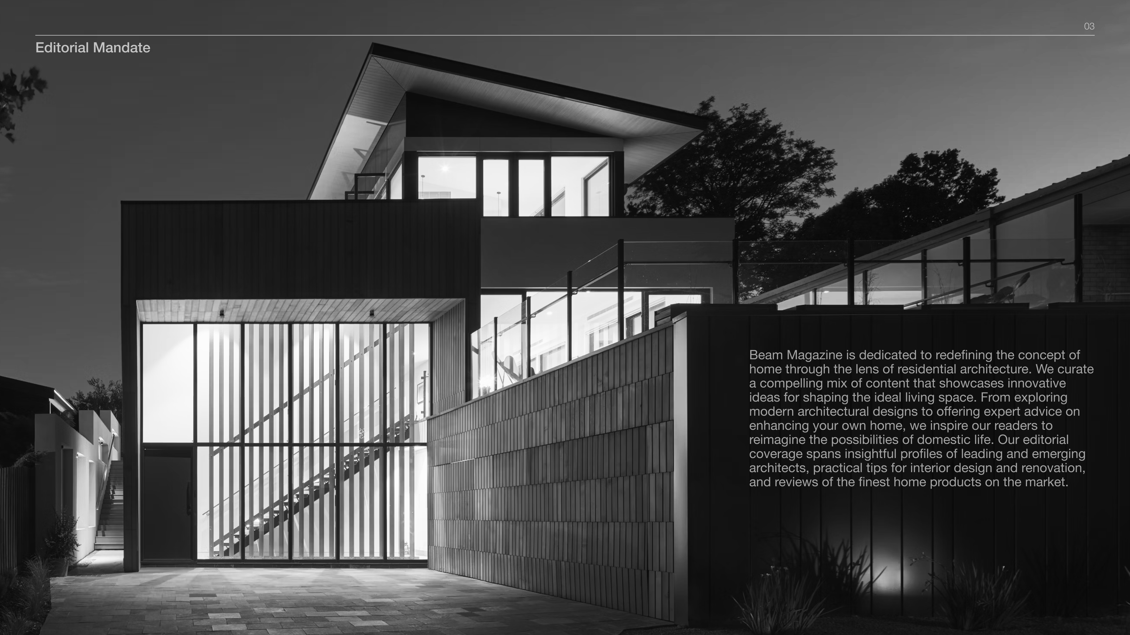
Figure 3. Editorial mandate. Click to enlarge.
03
The Readership
At the heart of our readership are educated, creative professionals who are passionate about the architecture and design world. Their discerning eye values quality over price when purchasing products, and they are constantly seeking inspiration to elevate their living spaces. They find joy in exploring the intricate details of beautiful architecture and design.

Figure 4. Overview of the magazine’s target audience.
04
Editorial Lineup
An editorial lineup that demonstrates a clear and logical organization of stories within well-named departments, featuring unique, concisely described, and creatively titled story concepts appropriate for the season and the target readership.
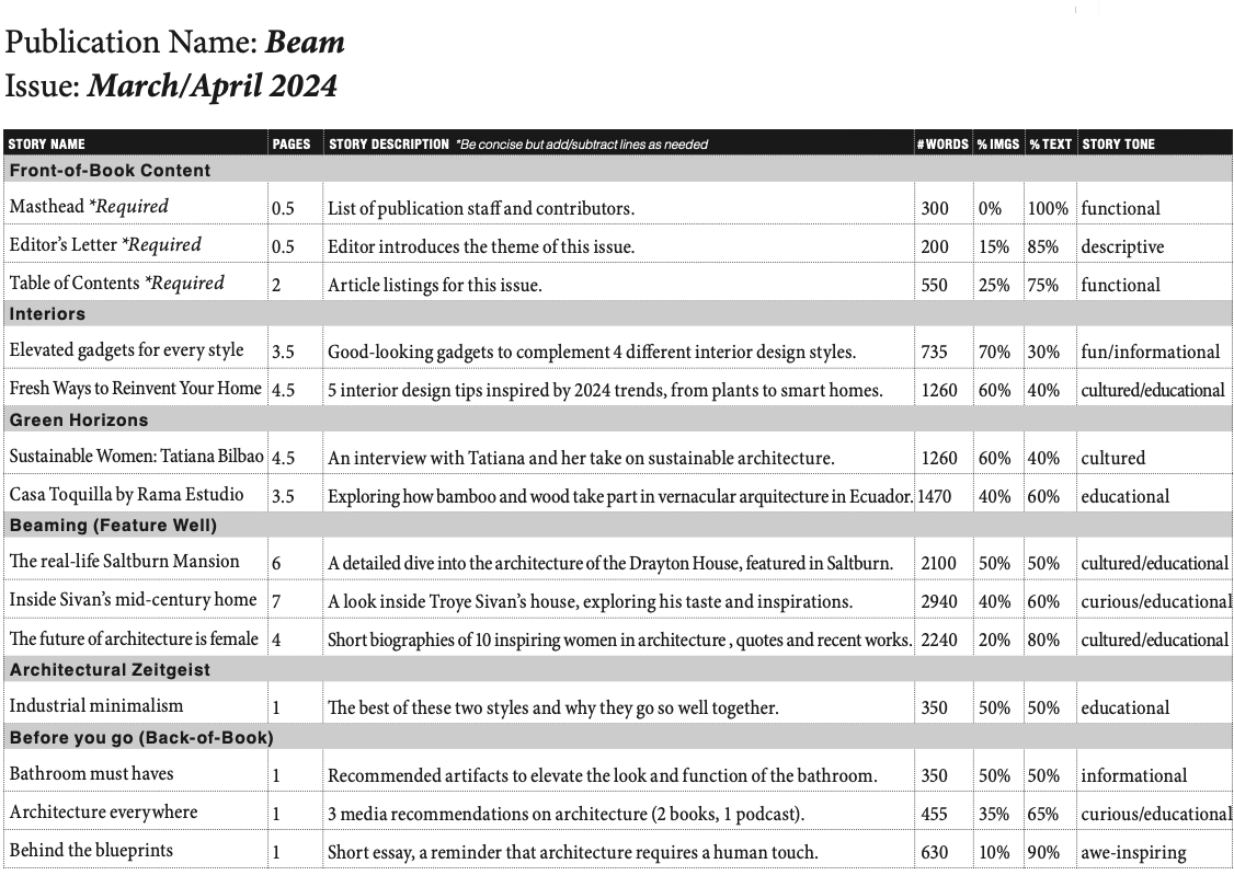
Figure 5. Editorial Lineup.
05
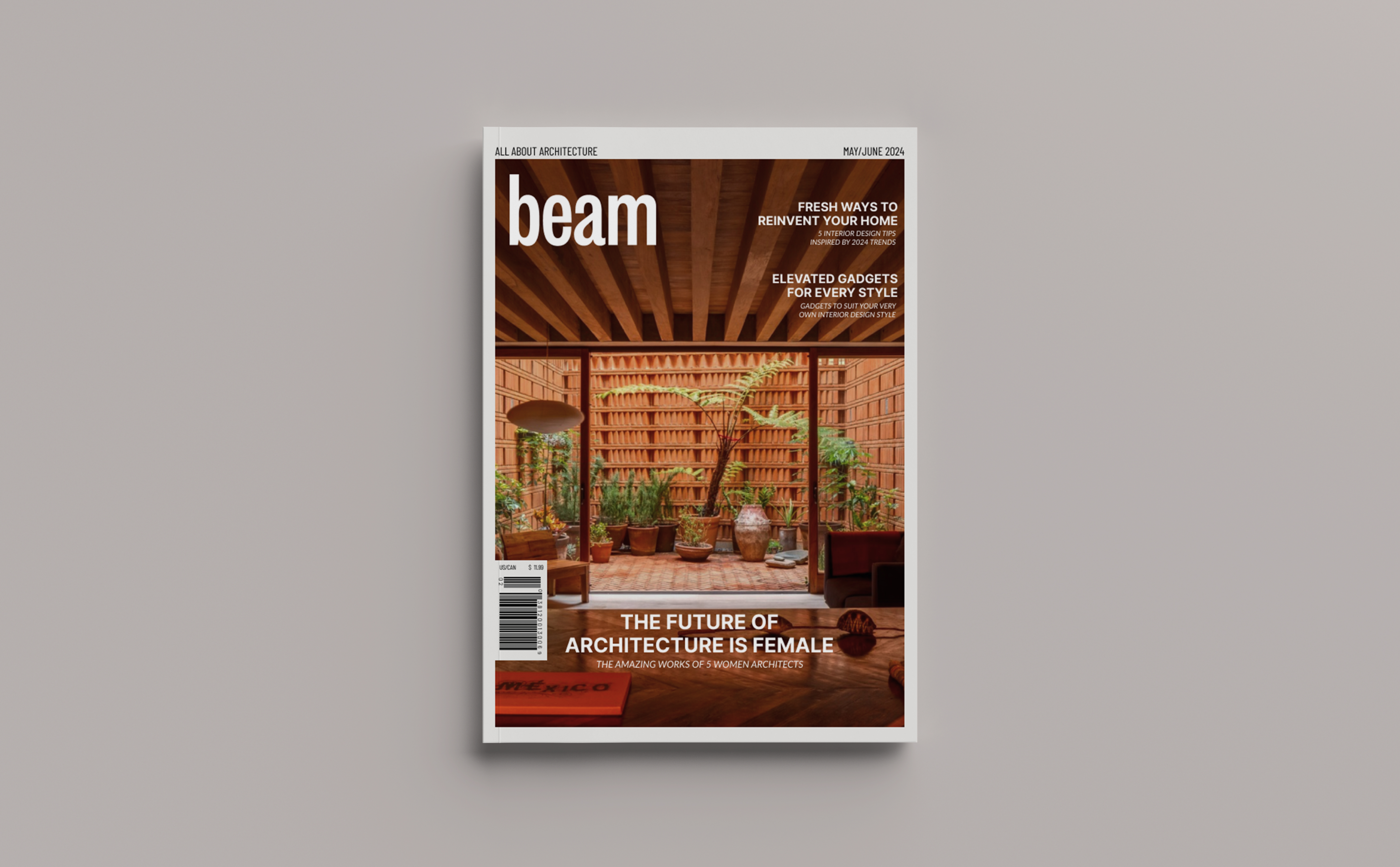
The Cover
After trying out different fonts, I found that grotesque typographies were more suitable for my architecture magazine because of their geometric design. I decided to use a condensed variation because it reminds me of the tall buildings we see in architecture. As for the image, I chose one of the pictures featured in the editorial story. Out of all the images, the warm colors and composition worked the best for the cover. I only added two cover lines besides the featured story because I wanted it to look clean. I made the cover line of the editorial feature more prominent with center alignment and bigger font size for greater emphasis.

Figure 6. Mocked-up cover.
06
The Table of Contents
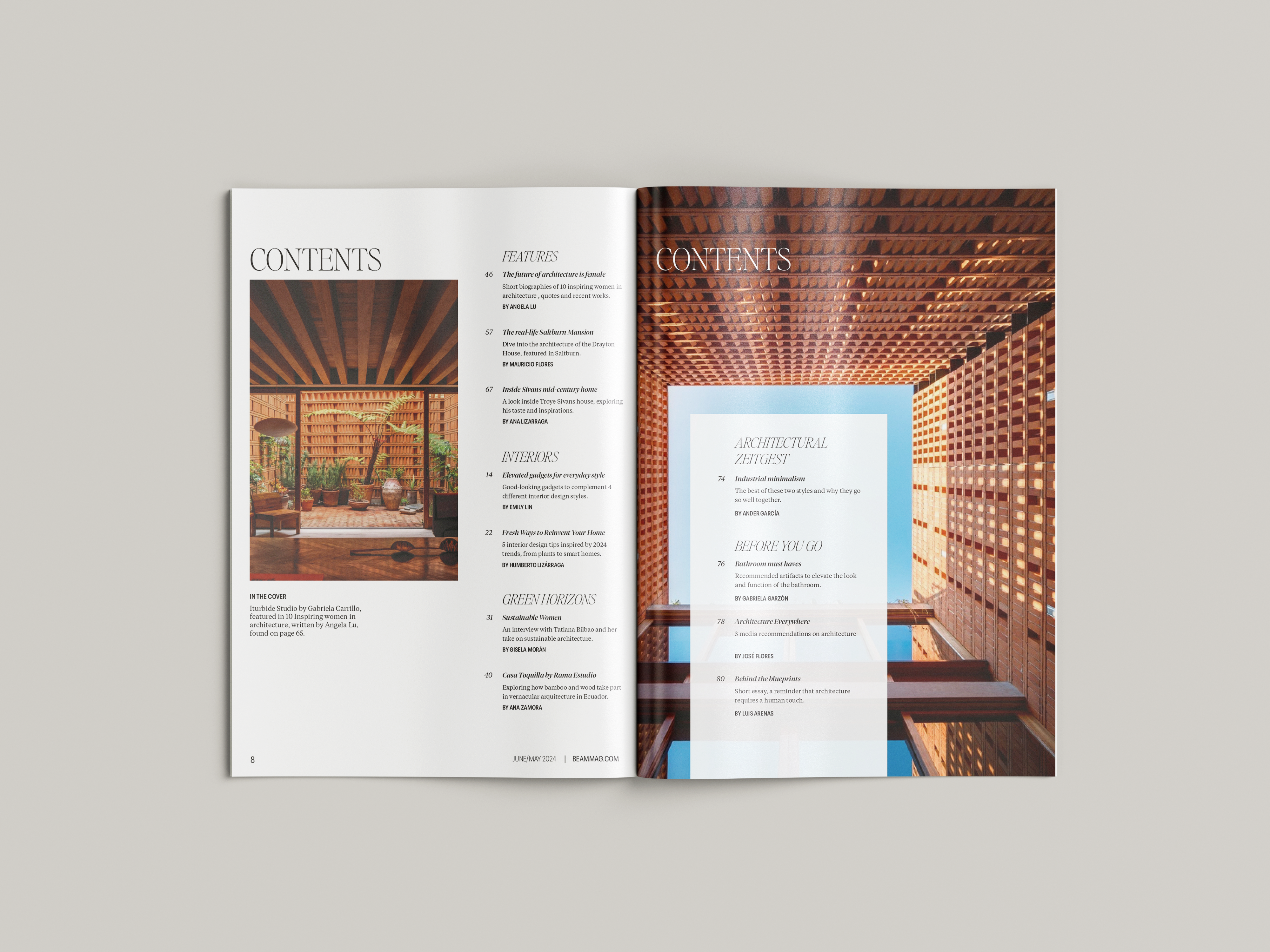
Figure 7. Mocked-up table of contents.
07
The Editorial Feature Story
I sourced my story content from various magazine articles, the architects’ personal portfolios, and Wikipedia. For art direction, I aimed to maintain a cohesive color palette throughout every spread, which involved color treating the pictures. For the works with better images, I dedicated a full spread, while for others, one picture sufficed on a single page. Additionally, I included headshots of every architect because I wanted to highlight not only their works but also the women behind these architectural masterpieces.
Figure 8. A flippable version of the project, including cover, table of contents and editorial feature story.
08
Web Editorial Feature Story
In addition to the print version, I extended the magazine's presence by designing a web version of the story. This involved crafting the header, navigation bar, and providing a teaser of the story content. Additionally, I incorporated advertising elements, including an imaginary subscription ad for Beam, promoting the magazine's subscription service to online readers.
In addition to the print version, I extended the magazine's presence by designing a web version of the story. This involved crafting the header, navigation bar, and providing a teaser of the story content. Additionally, I incorporated advertising elements, including an imaginary subscription ad for Beam, promoting the magazine's subscription service to online readers.
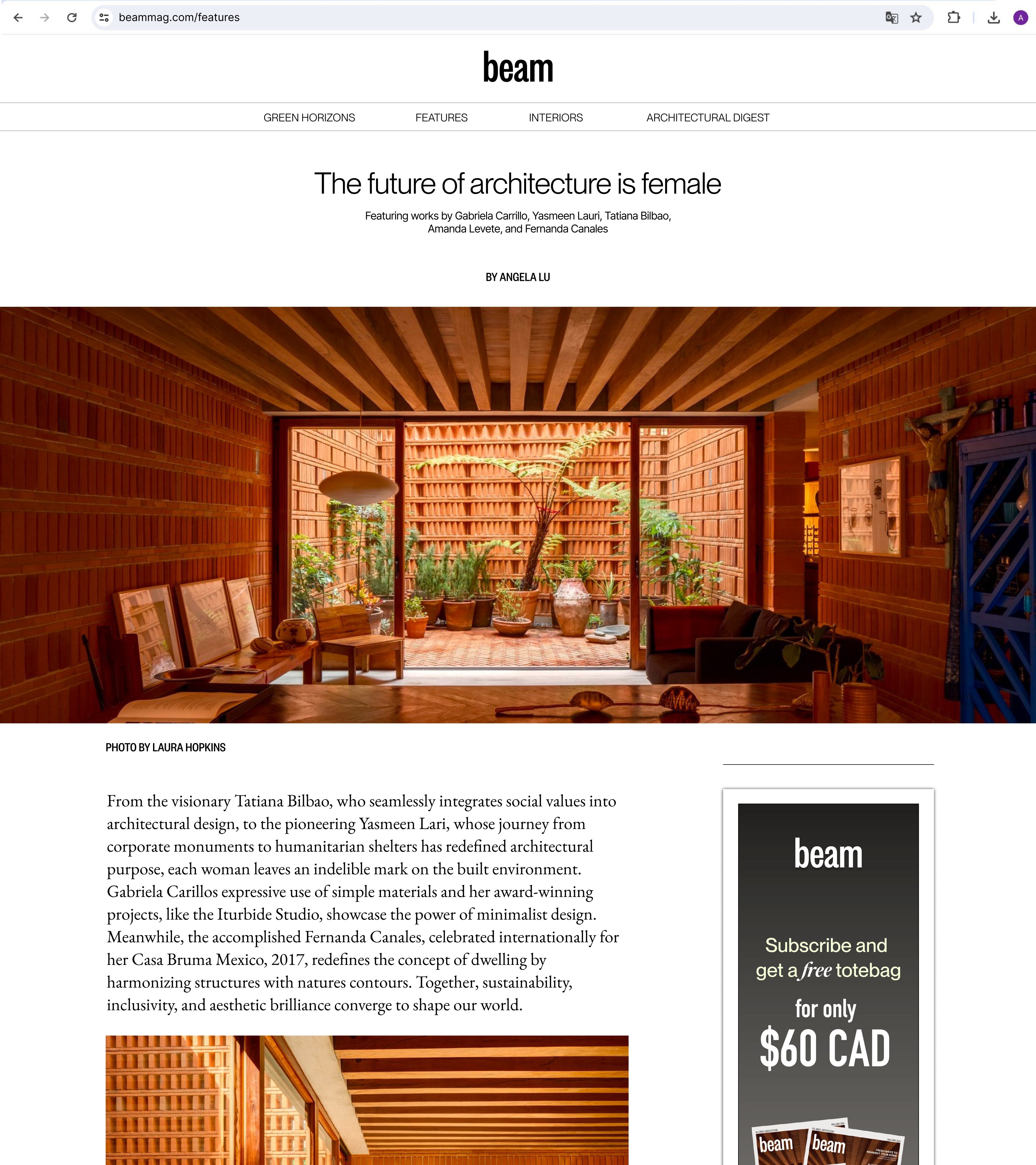
Figure 8. Web mockup of editorial feature story.
09
Subscription Card
Finally, as part of the magazine’s subscription campaign, I designed a double-sided blow-in subscription card with clear branding, a concise call-to-action subscription offer, and imagery that supports the offer.
![]()
Finally, as part of the magazine’s subscription campaign, I designed a double-sided blow-in subscription card with clear branding, a concise call-to-action subscription offer, and imagery that supports the offer.

10
Reflection
This project served as my introduction to editorial design, providing me with invaluable insights into both print and digital publishing processes. From conceptualizing the magazine's name and content to crafting each page layout, I now understand what an intricate process it is. Moving forward, I'm excited to explore different cover design options beyond using photographs.
This project served as my introduction to editorial design, providing me with invaluable insights into both print and digital publishing processes. From conceptualizing the magazine's name and content to crafting each page layout, I now understand what an intricate process it is. Moving forward, I'm excited to explore different cover design options beyond using photographs.