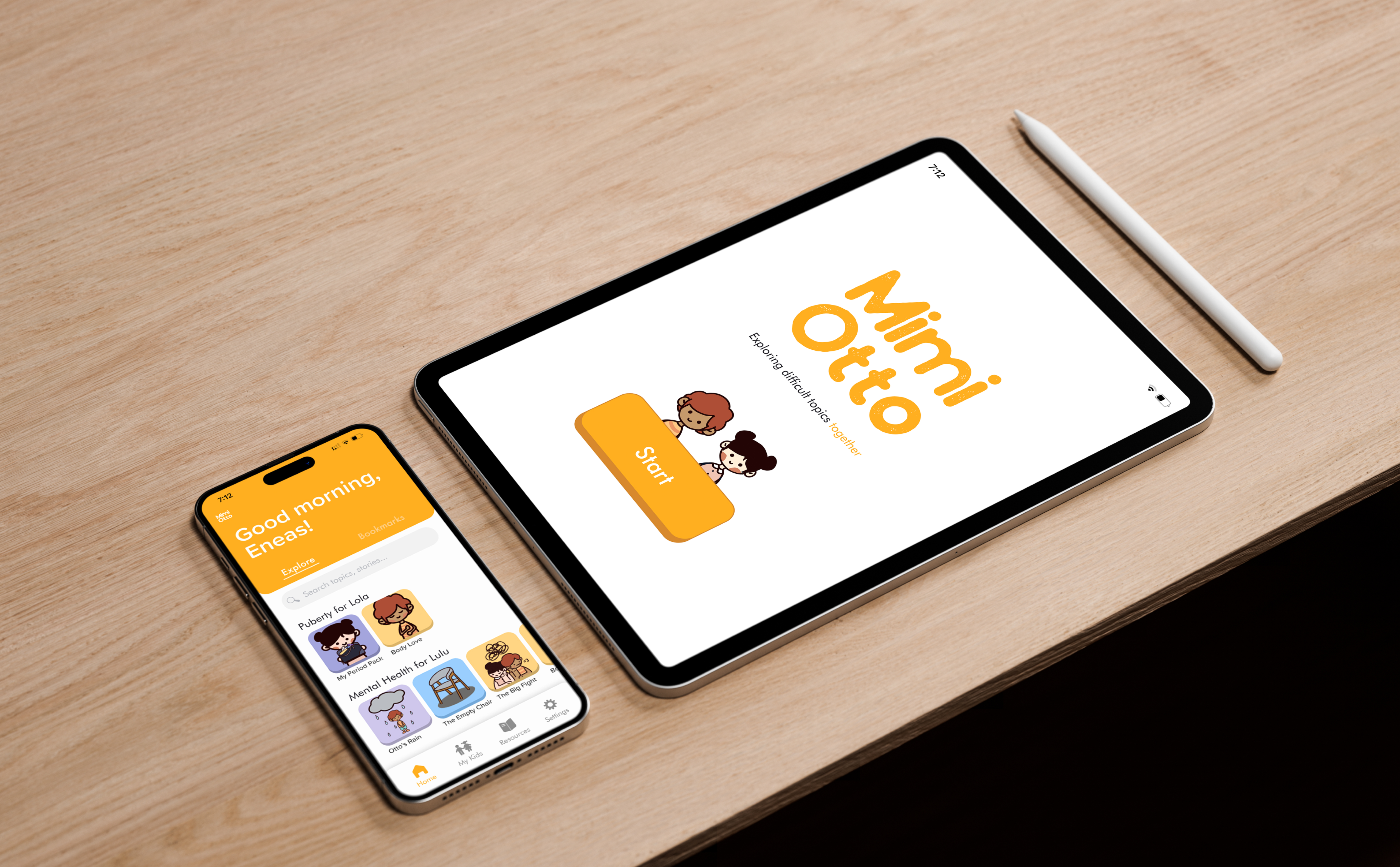
Figure 1. Mockups of Mimi and Otto
Mimi and Otto
Mobile App Design, User Research & Testing2023
tools
Figma, Procreate
scope
7 weeks
my role
UX/UI design, User research, User testing
team
Ana Lizarraga, Jessica Li, Emily Lin, Kirsten Wong, Deborah Wang
01
Overview
In a senior interface design course at Simon Fraser University, our team designed, prototyped, tested and pitched an App idea to the class in 7 weeks.
Mimi and Otto is an educational and parenting tool, meant to alleviate the discomfort and uncertainty parents face when discussing challenging topics with their preteen children, aged 8-12, through tailored interactive stories.
02
The problem space
how might we alleviate the discomfort and uncertainty parents face when discussing challenging topics with their preteen children?
We chose parenting and childcare as our domain of interest due to its multiple factors and challenges that allow for intervention. These include parenting methods, technology use, education, and child development.

Figure 2. We defined our main users as parents of kids aged 8-12, and conducted interviews with 10 people. After conducting the research, my team and I extracted the main insights from each interview.
03
Findings and Analysis
“Everything is bombarded with information about sexuality, even I don't get it, how am I supposed to explain it to my kid?”
Through our research, we discovered that numerous parents expressed concerns about addressing challenging subjects with their children, including puberty, grief, and sex education. Recognizing this need, we identified an opportunity to develop a tool that assists parents in navigating these difficult conversations while facilitating a better understanding of these topics for their children.
04
User personas

Figure 3. Based on our interviews, we synthesized valuabe insights and generated two user personas
05
Experience Map

Figure 4. I Identified and mapped out possible touchpoints and design opportunities within the user’s experience, focusing on our user persona Carlos.
06
The App
Our proposal
Our research revealed that parents often feel uncomfortable discussing certain topics with their children due to feelings of awkwardness or inexperience. In response, we created Mimi and Otto: a conversation-enhancing and education tool aimed at facilitating healthy discussions between parents and children. With its customizable features, Mimi and Otto empowers parents by offering resources to understand these topics while also engaging children through interactive stories.
Our research revealed that parents often feel uncomfortable discussing certain topics with their children due to feelings of awkwardness or inexperience. In response, we created Mimi and Otto: a conversation-enhancing and education tool aimed at facilitating healthy discussions between parents and children. With its customizable features, Mimi and Otto empowers parents by offering resources to understand these topics while also engaging children through interactive stories.
07
App Features
Pairing devices
When creating an account, parents can easily pair their child’s device to their account with a pairing code generated by the app, or through a QR code. This allows parents to curate stories tailored specifically to their children’s needs.
When creating an account, parents can easily pair their child’s device to their account with a pairing code generated by the app, or through a QR code. This allows parents to curate stories tailored specifically to their children’s needs.
Additionally, parents have the flexibility to manage their kids’ accounts and to pair devices later on.
The Story
As a team, we developed an interactive story about menstruation tailored for young girls experiencing their first period, thought especially for parents who may be unsure how to educate them on this topic.
After testing the app with chidren, I noticed users were unsure how to navigate the story. To address that, the team implemented hints and visual cues that indicate where to click. This example shows a glare on the window and a ringing alarm that prompt interactions.
The story incorporates both entertaining and educational content for children. In this section, kids can learn about the various types of pads and their different uses.
The Parent’s Side
Parents are first welcomed to the app with an onbording that provides a framework for navigating through the application, articulating potential interactions and building user expectation.
Parents are first welcomed to the app with an onbording that provides a framework for navigating through the application, articulating potential interactions and building user expectation.

The Home Page
The home page provides an overview of available stories, categorized by topic and tailored for each child. Parents can easily browse and access stories, saving their favorites to bookmarks for future reading.
The home page provides an overview of available stories, categorized by topic and tailored for each child. Parents can easily browse and access stories, saving their favorites to bookmarks for future reading.

My Kids dashboard
I was responsible for designing the My Kids section, allowing parents to manage their children’s activities in one place. Within this section, users can efficiently perform actions without the need to navigate back to the home page to find each story.
To facilitate the management of multiple accounts, I implemented a tabbed navigation, allowing users to seamlessly switch between each child’s account.
08
Style Guide

Figure 5. The defined style guide for the phone version of the app.

Figure 6. In order to engage with a younger audience, our team introduced the characters Mimi and Otto as the protagonists of our stories. Bringing these characters to life involved extensive illustration work, undertaken by my talented teammates, Emily and Jessica<3
09
Reflection
This project provided me with an opportunity to delve into various aspects of UX/UI design, encompassing tasks such as problem definition, user research and testing, style guide development, wireframing, and prototyping. Even while collaborating within a team of five, I actively participated in each stage, which allowed me to deepen my understanding and proficiency in every aspect of the design process.
Given the time constraints, my team and I were only able to design one story. In the future, I would like to go back and improve this project by generating additional stories to address other topics.